We all want to achieve a stellar onboarding experience for our customers. What if we shortened the optimization process by pulling inspiration from the best-of-breed product-led companies that do it well?
“Copy and pasting” won’t cut it, though. You need to do it differently.
In this webinar wrap-up we’re going to:
- Break down onboarding from two successful product-led companies;
- Show you their inner workings (all legally obtained!);
- Provide tips on how to apply these tactics to your business.
Let’s dive in!
What is user onboarding? (Setting the context)
User onboarding refers to the process that people go through from signing up to experiencing the promise of the product for the first time.
But that means we need to define that promise. To do that, we’ll look at different websites of successful product-led companies, identify the promise of their products, and then judge the process that users go through to arrive at that promise.
So we won’t just look at tactics, interface elements, or how certain elements are built, but rather, we’ll judge the path from sign-up to experiencing the promise of the product.
We’ll focus on the promise of the product because it is always linked to the core value that your product or app can deliver to the user.
Onboarding teardowns from successful product-led companies
Example #1: Appcues
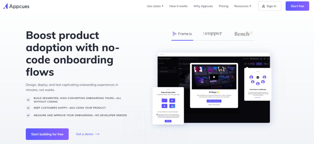
- The purpose: Appcues is an online tool that helps folks who are setting up elements like onboarding, product tours, etc. on their website or app without any code.
- The promise: To make product adoption easy.
- The target customer: Product manager and customer success are the key target customers, but also product marketers (not necessarily for onboarding, but to launch features).
- How activation is measured: Appcues’ definition of activation is somebody who launches an experience, be it a product tour, checklist etc. on their own product.
Breaking down the process to experience the promise:
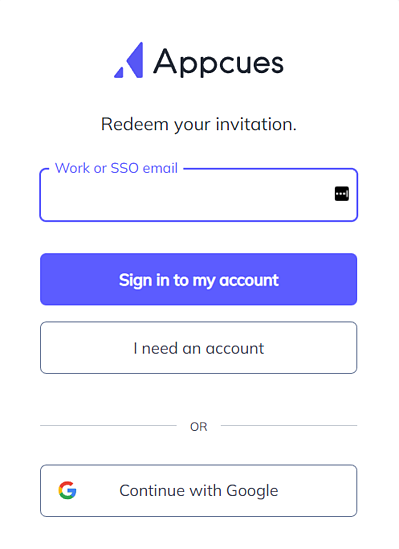
Step 1: CTA – “Start building for free”
? Tips:
- Accompany “Try for free / create your free account” by an indication if a credit card is needed or not to create the account;
- Add social proof on the page.
- After you have the email address, the user has already created an account with a password. Instead of just asking for just First / Last name, it’s a good opportunity to ask about the role: “Are you a Product manager? Product marketer?” etc. This is a great place to ask these questions because either of those is a confirmation that this is the right tool for the customer.
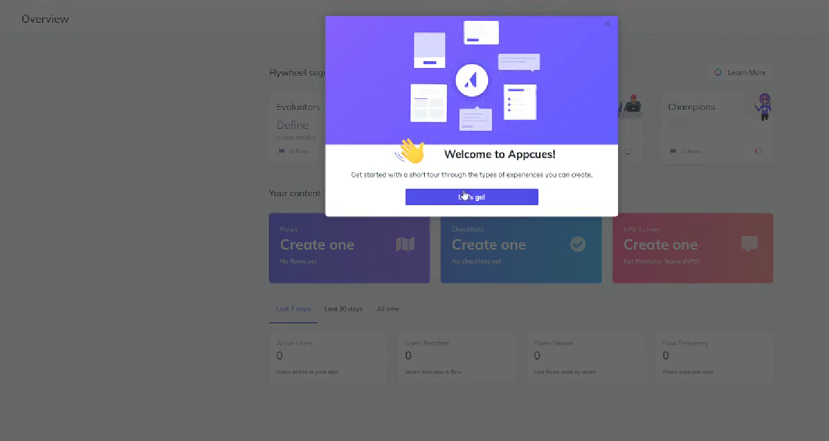
Step 2: The Welcome Message
? Tip:
- Keep experimenting with welcome modals.
Appcues tried removing the welcome message for a period of time, and it caused the onboarding rate to increase more quickly.
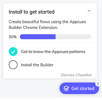
Step 3: Run through of the top x feature sets + add checklist
Showcase the top feature sets and then add a checklist where the customer is, showing that they’ve completed certain steps already and what they need to do next.
? Tips:
- By showcasing the features, the user already knows what your tool does without actually interacting with it at all. Now the customer has an idea of what to expect.
- Match the key features showcased in the product with the promises made on the website – make the guide relevant to the user and match their expectations.
- Experiment with which feature set to showcase, and the order in which you show them – use also the segmenting info you collect during sign-up to determine which features to show.
- Add a checklist because, if by mistake, the user didn’t realize what they’d just done, the checklist lets them see what they just did, and what to do next.
- Useful to have templates or “recipes” for certain objectives – “a recipe for product launches,” and so on.
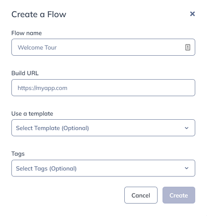
Step 4: Building a flow
? Tips:
- Examine the data as there’s going to be friction in such a heavy area.
- Look for ways to streamline it. Whether or not you should delay heavy lifting for the user will be determined by looking at the data.
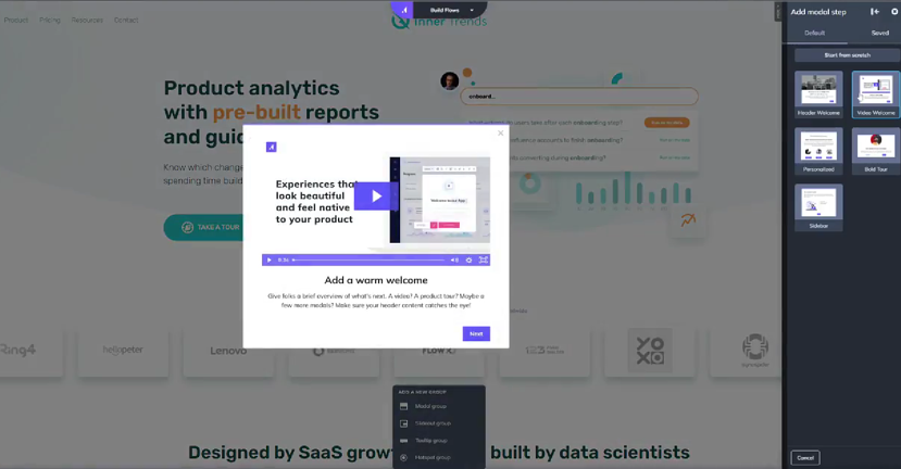
Step 5: Building the model
? Tips:
- The user can quickly see and preview what different elements will look like on their website in the background.
- Having a video version and a written version is more swipeable.
Example #2: Swydo
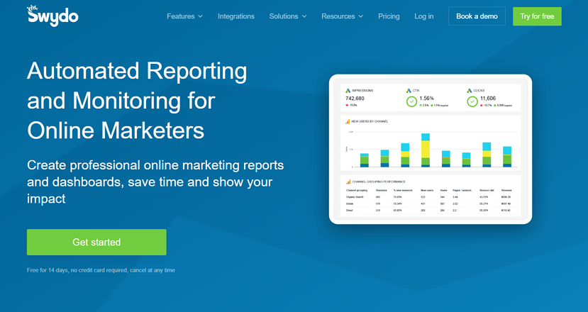
- The purpose: Swydo is a company that builds automated reporting and monitoring for online marketers.
- The promise: The user can quickly build a report that they can share with the clients.
- The target customer: Small, digital agencies that do advertising. It’s likely the consultant or account manager that will be using the product.
- How activation is measured: Publishing or sending a report (test or real) to someone.
Breaking down the process to experience the promise:
Step 1: CTA – “Let’s Get Started”
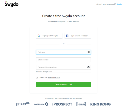
? Tips:
- Ask an open ended question during sign-up to learn about the people who are signing up for your product: “What was the problem or the challenge that led you to sign up for our product today?” Followed by an open text field.
- As those responses start to come in, you’ll recognize the patterns, and you can organize those patterns into themes. Then you can turn it into a drop down. Once your website is doing a great job of bringing in high-growth, high-product-fit people, you can remove the question.
Step 1: CTA – “Let’s Get Started”
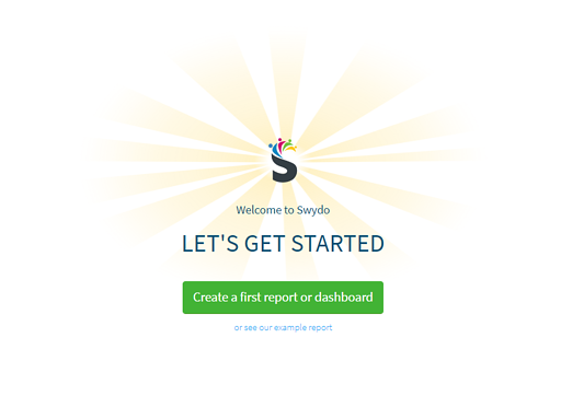
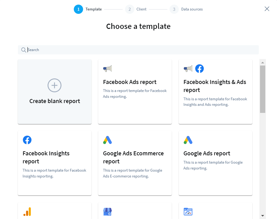
? Tip:
- If the user is coming from a landing page where they clicked on starting a specific use case (in this example, “Google PageSpeed Report”), that should be the template they’re seeing first.
Step 3: Sharing the report / Connecting the tool to your website
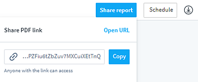
? Tip:
- Show or prompt the user as to how to the last action that marks the end of the onboarding process.
Final thoughts
- Best practices matter a lot, but make sure to look at the data, do customer interviews, do research to see what customers want. The optimization of the process itself will give you increases of 5%, 15%, 20%, but you will not double the onboarding rate.
- If your onboarding process has a low conversion rate, start analyzing the pages before the sign-up process, not the sign-up process itself.
- Update the messaging on your website; when the promise is clearer, it resonates with your ICP, and the trial to pay conversion rate will increase because a higher quality target is signing up.
- It comes down to whether or not your product is introduced in a way that makes sense for the customer and gets them to value as quickly as possible. That shows them that the problem they came to your product for is going to be solved. Even if they aren’t able to solve it fully, they’re at least able to see enough of the product to feel confident that it will be solved.
Want to watch the whole webinar? Check it out here:
