This is a guest post from Nick Holmes, Marketing Director at Nickelled, a guided tour solution for SaaS companies looking to increase their user onboarding and retention.
Congratulations! Your user has just clicked the big ‘Begin Trial’ button on your site.

Unfortunately, as so many startups discover, it’s not time to drown yourself in confetti just yet.
Statistically, 40-60 percent of customers will never return to an app that they sign up for, and if your trial-to-paid conversion rate is in the double digit range (without a credit card provided upfront), you’re doing better than most.
Signing up for an app in 2016 isn’t a sign of commitment any more. All too often, it’s actually the SaaS equivalent of the first date — uncomfortable, awkward and destined for failure.
But it doesn’t have to be that way.
Companies that onboard their customers correctly see far higher retention rates and this generally translates to far higher revenue.
So, what are they key factors to take into account when designing a #winning onboarding process?
Showcase the right things
The temptation many people face when designing an onboarding flow is to showcase as much as they can — after all, your product is great and people should see as much of it as possible, right?
Urm, not really. In reality, your customers’ time is precious and the only thing they want is to understand how your product enables them to do what they want to do — and that is why the best onboarding processes are designed with ‘key activation events’ in mind.
Key activation events refer to the actions a user takes which brings them closer to the eventual goal they had when they signed up for the app.
The key activation event will obviously vary — for a photo sharing app it may be uploading their first photo, for a business communications app it may be adding a colleague — but fundamentally, it’s a ‘must-do’ action if the user is to experience success with the product.
To give you an idea of how a key activation event should look, examples we’ve seen in the past include:
- Published post/entry/article/tweet
- Uploaded logo/profile picture
- Connected bank account/payment processor/credit card
- Updated profile x times
- Added team members/friends
- Contacted prospect using app
- Linked social account
Given that key activation events are the DNA of any successful onboarding strategy, a lot of work needs to go into identifying them. The right event often isn’t as obvious as it seems and small actions may have a disproportionate effect on success rates.
Include enough steps, but not too many
We specialise in creating brilliantly-simple guided tours for user onboarding, and although mercifully few of our customers create 100-step tours, we generally find that the onboarding processes followed by SaaS apps are too long, and often poorly-structured.
Armed with an understanding of your key activation events, it should be possible to shorten your onboarding process dramatically with the objective of bringing the user to success as soon as possible.
However, removing the chaff is only the first part.
Critically, it should also be possible to break the process down into multiple steps to avoid user fatigue.
This necessity for brevity makes an onboarding process which covers multiple points at once very undesirable. Instead, we recommend breaking the process down into individual steps aligned with key activation events and then delivering those prompts at a contextually relevant time.
The most obvious example of a process which tackles this well might be use of an in-app messaging platform like Intercom — if you’ve set up email messages which trigger depending on whether the user has performed a specific action in your app, you’re essentially already doing this.
However, email messaging is only one channel to deliver onboarding — we provide popup guides which can be triggered at contextually-relevant times, others provide ‘coach marks’ or CSS effects, and many mobile apps rely on push notifications.
As a parallel, consider route-finding. Before the widespread use of GPS, most online mapping solutions provided a step-by-step list of roads and turns.
The advance of in-car navigation systems means that we no longer need to spend time reviewing entirety of the route before we leave — we simply follow the instructions in real-time to get to our intended destination.
Your onboarding process should function in the same way, intelligently guiding a user as necessary, rather than presenting them with a list of to-dos upfront.
Make use of goals
Humans are inherently goal-driven creatures — it helps us to build skyscrapers, complete triathlons and become level 40 Pokemon trainers.
That desire to reach goals has been effectively used in computer-game design for years — great games strike a fine balance between posing a challenge and facilitating progress, which allows us to experience a rush of endorphins as we finally move to the next level (sometimes, they get it wrong).
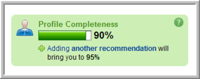
Nowadays, goal psychology is increasingly used in usability design, with progress bars such as those seen on LinkedIn (below) commonplace in modern web apps.

Such bars play on our dislike of incompleteness, triggering a desire to progress along a path to reach the perceived goal and achieve a sense of closure, but they also ‘ground’ the user by providing reassurance that there is an achievable goal in sight.
In onboarding, this is particularly important — the first-run experience is a critical one, during which a user’s patience is likely to be limited and an open-ended series of tasks is more likely to be met with abandonment as it is with compliance.
In an interesting post on Kissmetrics, Taige Zhang took a look at the likely ROI of building a progress bar and concluded that for a SaaS app with a LTV of $4.1k and 100 new users per month, any lift in activation of over 0.3% would be profitable.
Include a quick win

Studies have shown that human perception of accomplishment activates our dopamine circuits, making the user feel good by triggering the brain’s pleasure centers.
This effect can be powerfully leveraged in usability design by building in ‘quick wins’, which simultaneously raise the user’s perception of the app and gain an understanding of how to use it.
Quick wins can be tied to the key activation events referenced above, but they could also be standalone achievements — the key thing is that they a) make the user feel good and b) help them along the path to a key activation event.
If any points of user interaction in your app are non-standard (i.e. not a common user interface design pattern), quick wins are a great way to build familiarity with them — rewarding the user with something as simple as an animation of the element can trigger a feeling of satisfaction.
Tell your users ‘why’
In general, we humans value having a strong sense of what’s going on — we have a very strong cognitive bias against uncertainty, which originally stopped us from taking wild steps into the unknown which could have resulted in us being eaten by, for example, a lion.
This bias against uncertainty and towards knowledge can be leveraged in an onboarding process to encourage completion by providing the ‘why’ before the user even has to ask for it — a process outlined by psychologist Robert Cialdini in Influence: The Psychology of Persuasion.
“A well-known principle of human behavior says that when we ask someone to do us a favor we will be more successful if we provide a reason. People simply like to have reasons for what they do.”
Take a look at the following (real-life) examples:
- 90% of users who add a picture sell their car in 2 weeks.
- Users with complete profiles are 40 times more likely to receive opportunities through LinkedIn
- Users who verify their credit card receive 40% more applicants for their jobs
Each of these is an unsubtle but effective nudge to complete a task because of a certain reason, and they’re very effective. While things are normally obvious to the person designing a form, they may be far less so to a user.
Allow for mistakes
In a study by Lori. S. Mestre at the University of Illinois, students asked about their preference for text-based tutorials over video-based tutorials repeatedly cited the ease of access of the text-based guide as a reason for their preference.
Navigation is a critical part of any onboarding process, and it’s vital that users know how to go back and fix things if they make a mistake. In a guided tour, this may be as simple as a Back button, but in other onboarding types it’s often not so easy.
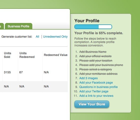
To reduce frustration, it’s worth putting all of the steps in an ‘anchor’, which contains everything that needs to be done and allows the user to navigate to a specific one, if required.
Take this example from GroupOn, which showcases the steps that need to be take but also allows the user to skip backwards if required:

Make it measurable
Cohort analysis is a technique that groups users that share a common trait over a period of time, allowing businesses to compare the impact of that shared trait on a desired outcome.
A simple example of cohort analysis might be to group all users who arrived via a paid search campaign and see how they convert compared to those who arrived via organic searches (clue: it should be higher!).
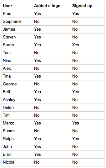
In user onboarding, cohort analysis is valuable when looking at the effect of a single step on the desired outcome — for example, whether adding a logo has an effect on a user’s’ likelihood to convert.
Take this example:

In total, 20 users started a trial and 11 users signed up — a trial-to-paid conversion rate of 55 percent.
However, when we group these users into those who added a logo and those who didn’t, we can see that users with a logo were 3 times more likely to convert than those without.
At a larger scale, this kind of data is invaluable, and it’s part of the reason your onboarding process must be fully measurable.
Use software such as InnerTrends, Amplitude or Google Analytics to track the impact of key effects on your metrics and identify the key activation events which are likely to make your user onboarding successful.
Over to you
Fundamentally, your onboarding process will be highly dependent on your users, your business and the desired outcomes of those things combined.
However, the best onboarding flows tend to do the following things well:
– Show the value of the product to a user as soon as possible
– Make the steps along the route to value easy (and ensure that they appear easy)
– Clearly identify the benefit of each step and the end result
– Be measurable and improvable
There are no guarantees, of course. But thinking this way gives your business a strong foundation for building long-term customer success — and therefore ensuring that every user who signs up will return.
Looking for deep insights into how your customers use your product?
InnerTrends can help. You won’t have to be a data scientist to discover the best growth opportunities for your business, our software will take care of that for you.
Schedule a Demo with us and witness with your own eyes just how powerful InnerTrends can be.