Another question that’s been keeping me awake at night:
Why don’t we see amazing case studies and experiments that are data driven and can be replicated?
In a bid to find an answer, I went out into our online world and asked people, most of whom were product managers or marketers.
From the far corners of Inbound.org to GrowthHackers and from Reddit to HackerNews, people answered my questions.
Fifty people later, here are eight conclusions, and what you can do about them.
1. It’s not a one man show
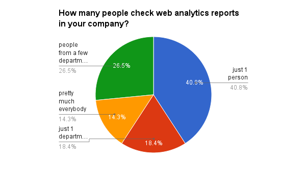
A data driven culture is a culture where all decisions are based, to at least some extent, on data. If there is just a single person in a company using the data, the chances are high that the company is not really data driven.
What you can do about it:
- Create internal dashboards that are shared with everyone.
- Send email updates with relevant data and make sure you check reports with the right frequency.
- Make sure everyone has access to data, while keeping privacy policies in place.
2. Almost half of companies don’t really understand the data that is being reported.
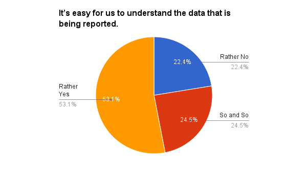
This can happen for different reasons but one of the most common is that people don’t really know what is being tracked and how. (See #8 below.)
Another reason is that most web analytics tools are designed for people who have at least some experience working with data sets. For everyone else, if the chart goes beyond a pie or a simple bar chart, there’s a real danger that they will misinterpret the data.
What can you do about it:
- Read a web analytics book and learn as much as possible about web analytics.
- Follow Avinash Kaushik.
- Take a free online course and subscribe to video tutorials and webinars.
3. No understanding = no answers.
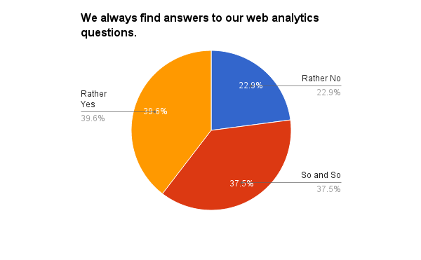
Even though more than 50% of respondents said that they understand the data in their web analytics tools, less than 40% of people said that they get answers to their business questions.
There can be multiple reasons for this from not collecting enough data to not using (or not knowing how to setup) custom reports. (See #5 below.)
What can you do about it:
- Implement a web analytics framework.
- Track everything that is important to your business and document it.
4. Data is accurate for less than 15% of respondents.
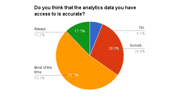
Data accuracy is crucial: if people don’t believe their data is accurate they don’t trust it. If they don’t trust it they won’t act on it, unless it reinforces their beliefs (which is unscientific and dangerous to do).
What can you do about it:
- Backup your web analytics service.
- Store raw data for the critical analytics events.
- Read our blog post and implement one (or more!) of the six lesser known methods for improving the accuracy of your data.
5. Default reports are for default companies.
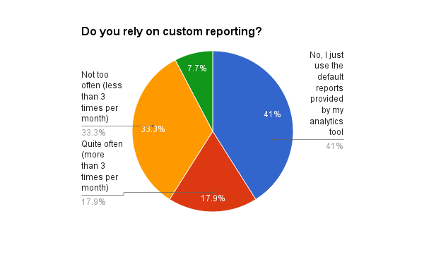
Almost half of the respondents said that they rely on default reporting only. As such, the chances are they don’t rely on this data for making business decisions. Each new project has its own key metrics and, most of the time, these metrics require custom reporting.
What can you do about it:
- Build your first custom report and send an email to your team to let them know what you learned.
- Start each day with a new question you need the answer to.
6. Segmentation is Queen.
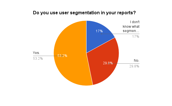
Not all visitors or users are the same. Treating them the same will only cause frustration and almost no forward movement or growth in your business, no matter how much you try.
Segmentation and custom reporting (see #5 above) are the key to a successful optimization strategy and data driven culture.
What can you do about it:
- Apply a segment. Go with a default one and see what you learn.
- Apply another segment. Go with an advanced one and make a change on your website, just for that segment.
7. Tracking codes are the front line of web analytics.
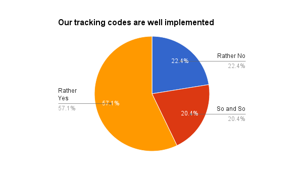
While the majority of companies that filled in the survey believe their tracking codes are well implemented, that still leaves more than 40% that don’t.
No wonder so many people don’t believe their web analytics data to be accurate! (See #4 above.)
What can you do about it:
- Do an audit on your tracking technology.
- Work side by side with the development teams to check each and every tracking code.
- Use tag managers and tool agnostic tracking that it is easy to debug.
8. Web Analytics is no side dish
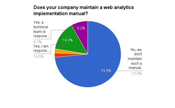
Companies document every procedure and every process. They document code and APIs but it seems that they rarely document the web analytics implementations.
No web analytics documentation results in people not understanding what is being tracked and how (see #2), it also means that data isn’t trusted because of inaccuracies they don’t understand (see #4) and it means they don’t get the answers they need (see #3).
What you can do about it:
- Easy: Start documenting your web analytics implementation, today!
Which of these eight pie charts resonates the most with you?
Identifying where your company lands for each of the questions is the very first step toward implementing changes that will lead to a more data-driven company.
But the survey didn’t just help you, we learned so much too, so a big thank you to every single person who took the time to give us their answers.
We’re looking forward to doing more surveys and experiments and we’d love to share the results with you. If you love experiments, click here to sign up for our free monthly digest.
Looking for deep insights into how your customers use your product?
InnerTrends can help. You won’t have to be a data scientist to discover the best growth opportunities for your business, our software will take care of that for you.
Schedule a Demo with us and witness with your own eyes just how powerful InnerTrends can be.